
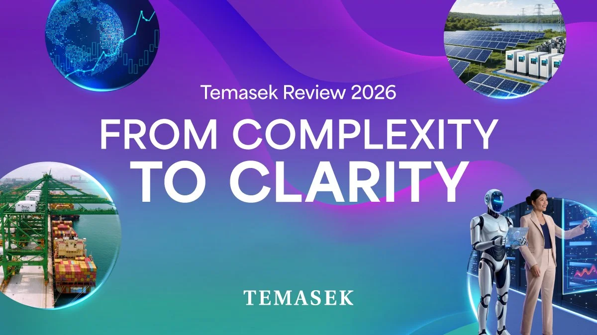
Making complex information feel human
Temasek Review is an annual publication that brings together Temasek’s performance, portfolio and perspectives for the year.
Working from the visual identity established for each year’s Review, our role was to translate a dense body of financial and institutional information into an engaging social experience across LinkedIn, Instagram, Facebook and YouTube.
But the challenge went beyond adaptation. With public understanding and trust an ongoing consideration, we saw an opportunity to make Temasek’s communications feel more accessible, using clearer narratives, more human language and thoughtful design to make complex information easier to understand.
“Hire so many highly educated and very highly paid people but only have subpar 20Y annualised returns. Don’t dare to show yearly returns. No accountability.”
Redacted Random RedditorHow do you make an annual review worth following?
The Temasek Review brings together a year’s worth of performance, portfolio developments and institutional perspectives — information that is important, but often complex and unfamiliar to audiences outside the financial world.
Social media presented a different challenge from the Review itself. People weren’t necessarily looking for this information, and dense institutional language could create even more distance between Temasek and the audiences it wanted to reach.
Our task was to find the stories within the Review, make them relevant to everyday audiences, and communicate them with clarity — without losing the accuracy and rigour the subject demanded.
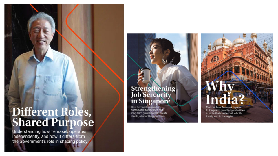
Proposed visual direction at pitch level.
Speak human.
We proposed a simpler principle: if we wanted more people to understand Temasek, we needed to communicate in a way more people could understand.
That meant looking beyond financial and institutional language to find the human story behind the information — clearer headlines, everyday words and narratives that connected Temasek’s work to a world audiences recognised.
Making the Review social
Across static, carousel and motion formats, we translated the Review into bite-sized stories designed around how audiences consume information on each platform.
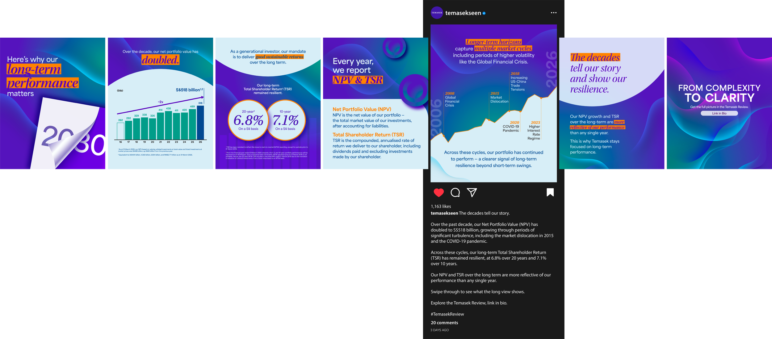
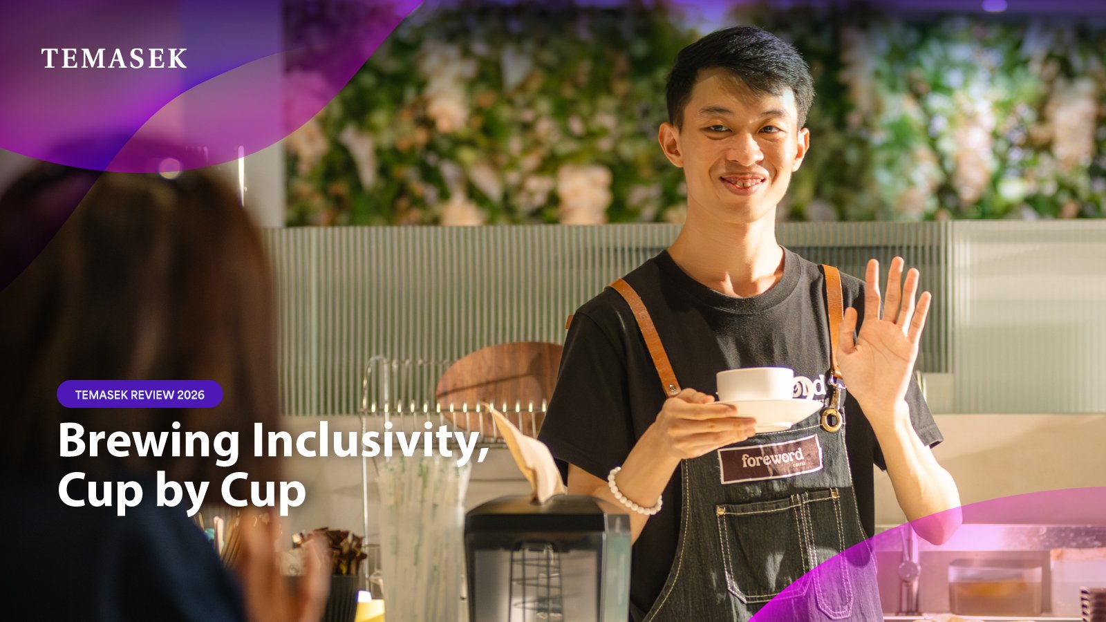
Not everything could be simplified.
Accuracy, legal considerations and established terminology remained non-negotiable.
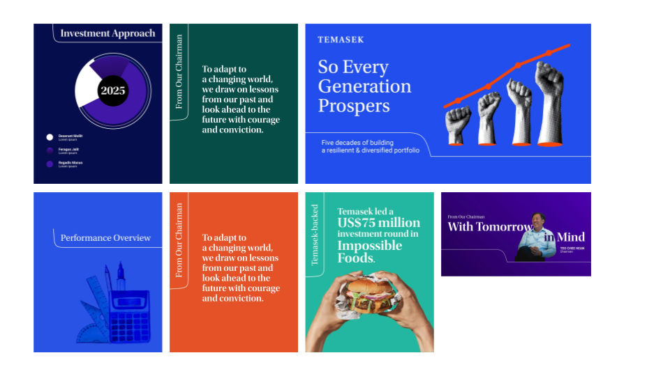
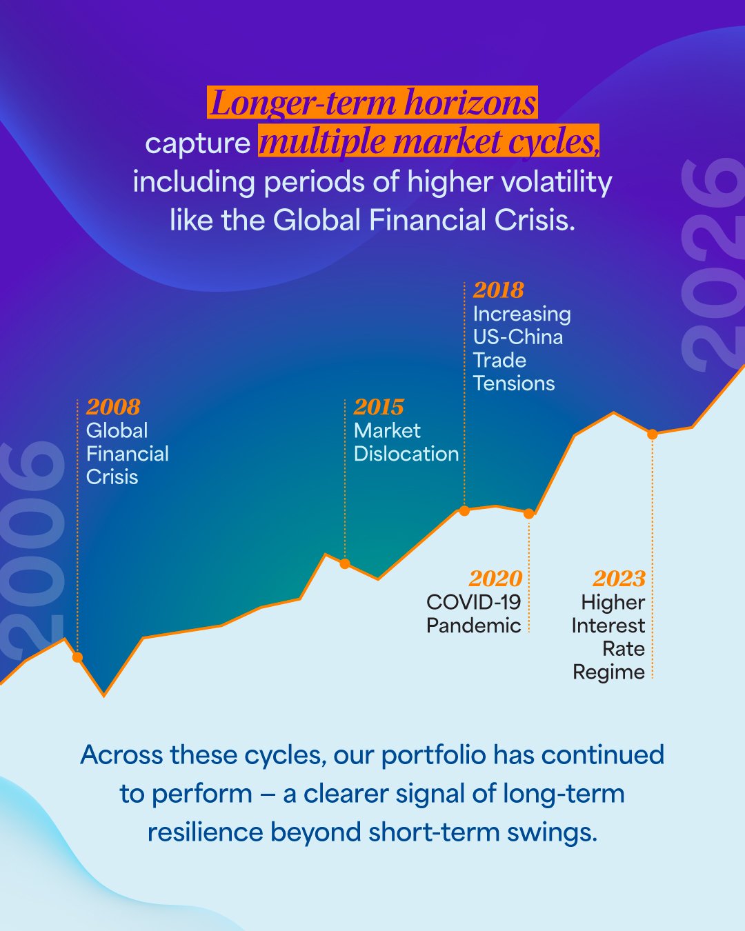
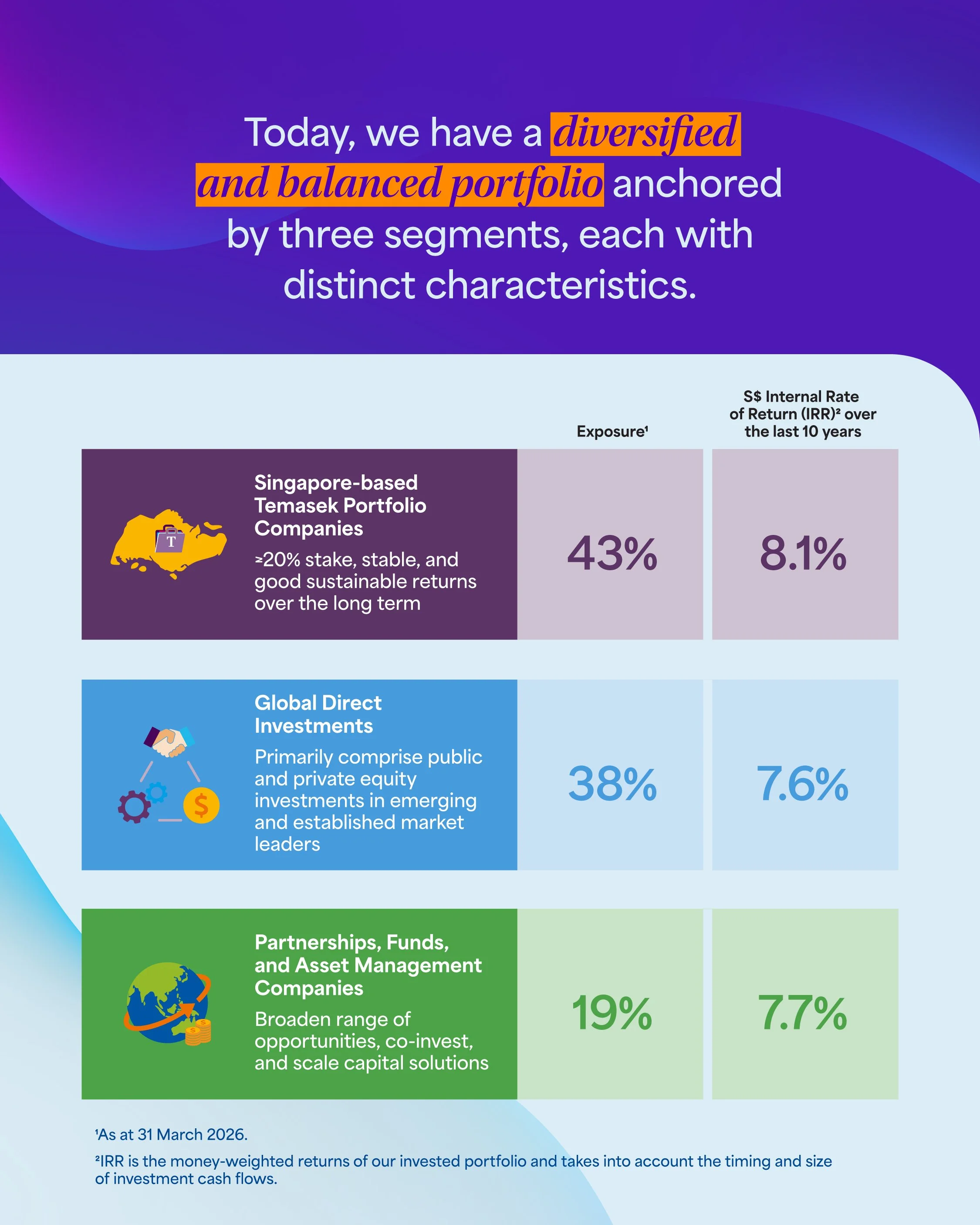
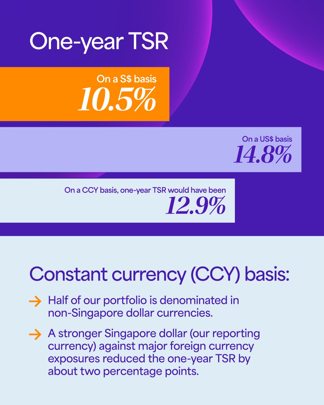
So clarity became more than a writing exercise: it had to come through narrative, structure, pacing and design.

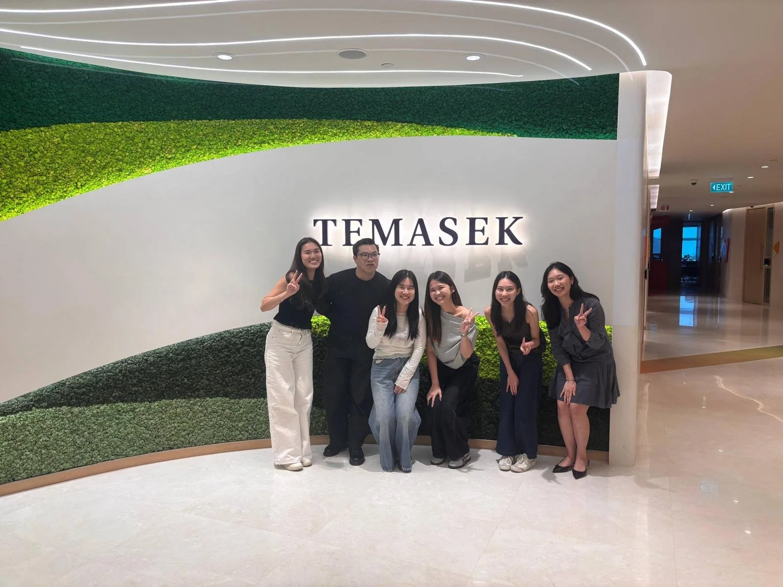

The Team
DSTNCT:
Associate Creative Director Shawn Heng
Art Director Shannen Sutanto
Art Director Cassandra Kuek
Jr Art Director Joreen Teh
Business Director Chloe Lim
Senior Account Manager Joshua Ang
Senior Account Executive Ethan Oh
Temasek: Director (Public Affairs), VPs (Public Affairs), Associates.
Year: 2026
My Role
As creative lead, I was responsible for carrying the creative direction through from concept to launch, ensuring that our social expression remained aligned with the wider Temasek Review identity across platforms and formats.
I worked directly with Temasek’s Marketing and Public Affairs teams, including VPs and Director-level stakeholders, navigating multiple workstreams, evolving content and layers of clearance throughout the process. This meant balancing different stakeholder priorities while protecting the clarity and consistency of the work.
The challenge was not simply to adapt an established brand for social, but to continually find the clearest and most human expression of complex information — while respecting the legal, institutional and brand requirements that could not be compromised.